
Alure Stay operates in Dubai’s luxury hospitality space — a market saturated with predictable luxury aesthetics and generic minimalism. The brand needed to feel intimate yet elevated, cinematic yet personal — standing apart from conventional villa rental platforms.
It wasn’t about “luxury.” It was about curated exclusivity.
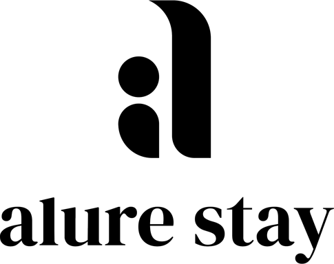
We built a refined identity system rooted in modern elegance and effortless intimacy.
The custom logomark balances softness and structure, creating a symbol that feels contemporary yet timeless. The wordmark introduces understated sophistication, allowing the brand to feel elevated without becoming ornamental or loud.
A deep, controlled color palette reinforces exclusivity and confidence, while a disciplined typography system ensures clarity and consistency across every touchpoint.
Beyond the logo, we developed a cohesive brand system including:
Logo lockups and usage rules
Color strategy
Brand dos & don’ts
Typography hierarchy
Icon system
Custom patterns
Applications & stationery
Every element was designed to create a seamless visual world — one that mirrors the Alure Stay experience: curated, intimate, and intentionally luxurious.
Alure Stay now communicates with clarity, restraint, and distinction — where luxury feels personal, not performative.
