

PROJECT Overview
Artistry partnered with Sanad to develop a distinctive brand identity for a real estate project rooted in stability, belonging, and modern living. The identity was designed to reflect the project’s vision of creating spaces that feel more meaningful than conventional developments, transforming architecture into a sense of home.
THE CHALLENGE
Sanad needed a brand identity that could stand apart in a crowded real estate market while communicating trust, warmth, and architectural sophistication.
The challenge was to create a visual system that balances structural strength with emotional connection, positioning Sanad as more than a real estate project, but a place built around belonging and human experience.
At the same time, the identity needed to feel modern and adaptable across physical and digital applications while remaining deeply connected to the architectural essence of the project.
OUR APPROACH
We built the brand around a simple guiding idea:
More than walls. It’s home.
This principle became the foundation of the identity system, positioning Sanad as a brand centered around comfort, stability, and connection.
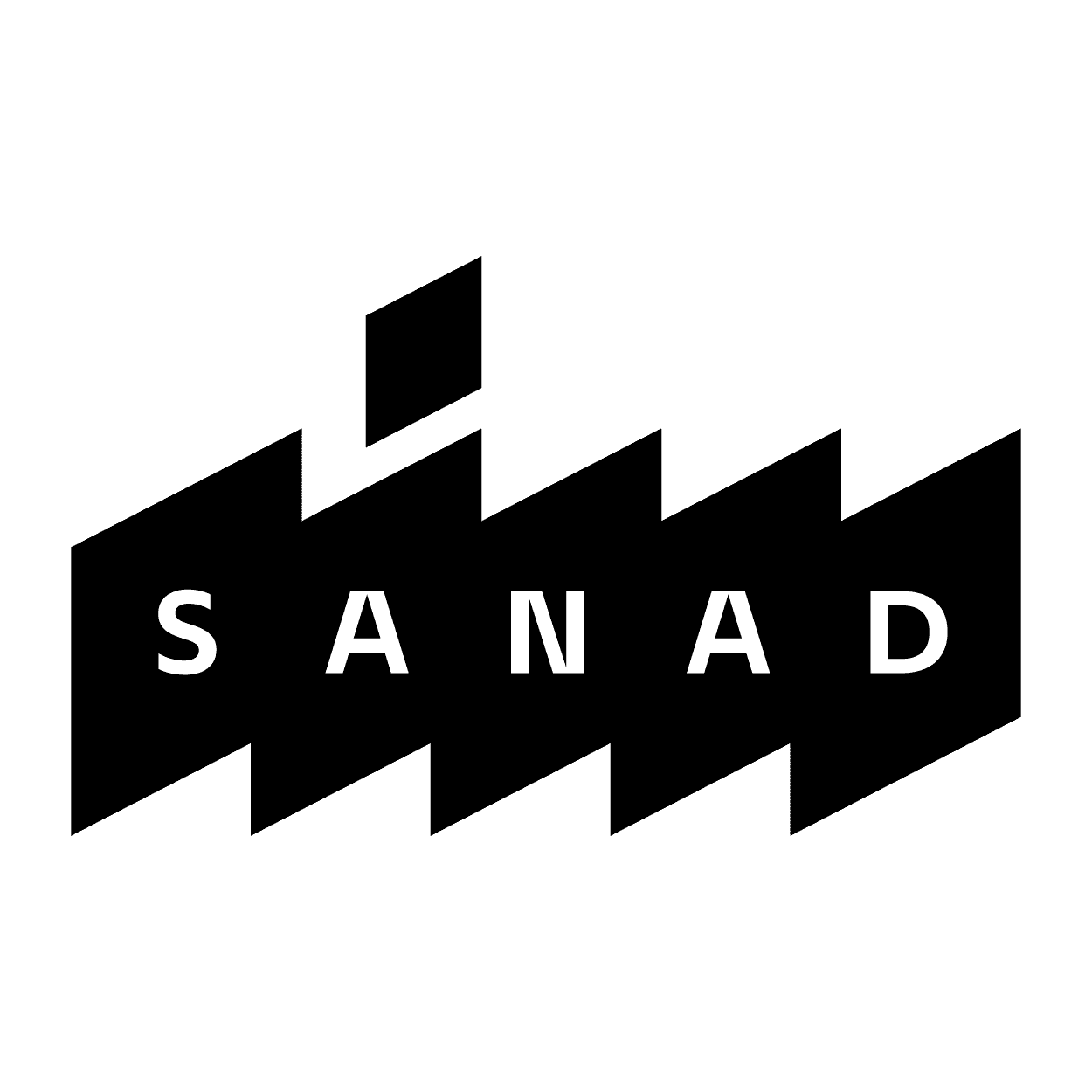
At the core of the visual identity is a logo inspired by architectural walls forming the Arabic name “Sanad.” The intersecting structure symbolizes unity, support, and strength, reflecting the deeper meaning behind the brand name itself.
The visual language combines geometric forms, earthy tones, and refined typography to create a system that feels grounded, modern, and trustworthy. Warm neutrals and deep green accents were inspired by the project’s architectural materials and surrounding natural spaces.
Together, these elements formed a cohesive identity system designed to communicate reliability, warmth, and contemporary living across every touchpoint.
SCOPE OF WORK
Brand Strategy
Brand Positioning
Logo Design
Visual Identity System
Typography & Color System
Brand Guidelines
Stationery & Brand Applications