WAYOUT began with a vision to create a women’s activewear brand that stood for something deeper than movement.
It was about the moments when women choose to push past expectations, step beyond limitations, and find the confidence to move forward on their own terms. Because every woman has her own path, her own strength, and ultimately, her own WAYOUT.
We took that belief and built a brand around it, one where activewear becomes a symbol of freedom, individuality, and self-expression. From positioning and identity to voice and visual language, and continued bringing it to life through campaigns, content, events, PR, and influencer collaborations, building experiences that connect the brand with the women and community around it.
• Brand Strategy
• Brand Positioning
Logo Design
Visual Identity System
Typography & Color System
Tone of Voice Development
Brand Guidelines
Packaging & Brand Applications
Social Media Design
Media Planning & Buying


As a new brand entering the saturated sportswear market, WAYOUT needed a clear and differentiated identity that could break through a category dominated by idealized standards and repetitive narratives.
The challenge was to create a brand that speaks to real women, celebrating authenticity over perfection, and strength in all its forms. WAYOUT needed to move beyond aesthetics and trends, positioning itself as a platform for empowerment and inclusivity.
At the same time, the identity had to remain bold, modern, and commercially adaptable, capable of extending across garments, digital platforms, and campaigns while maintaining consistency and impact.
We built WAYOUT around one guiding belief: Freedom begins where expectations end.
That belief became the idea of finding your own way forward, inspiring an emblem that represents the light at the end of a tunnel — a symbol of clarity, strength, and possibility.From there, the identity came together through bold typography, a grounded palette, authentic photography, and an expressive voice that celebrates women as they are.
Every element was designed with one purpose: to make WAYOUT feel like more than activewear, a reminder to move freely, confidently, and your own way.
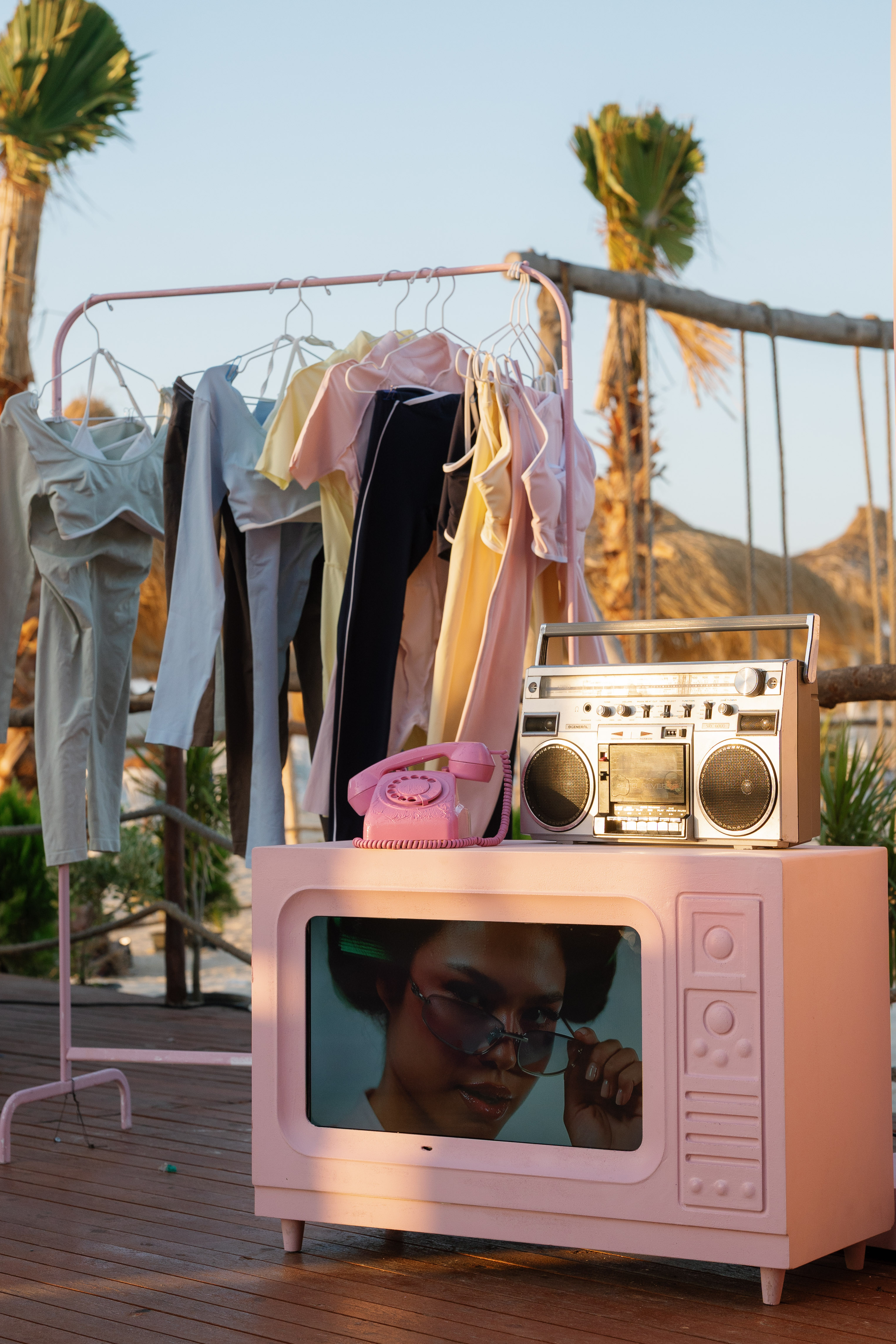
We carried that world into the brand’s campaigns and experiences, including the summer collection launch on the North Coast. Through creative direction, custom event design, setup, PR, and influencer collaborations, we turned the launch into more than a collection reveal, creating a physical expression of WAYOUT’s energy, community, and spirit.